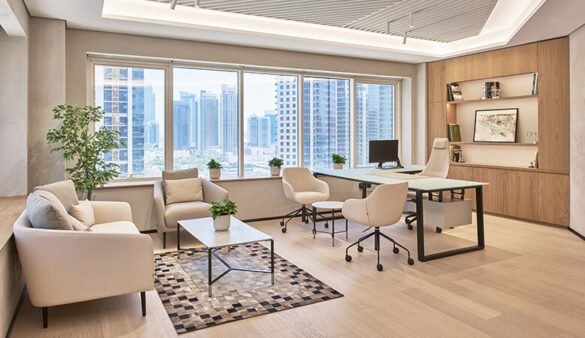
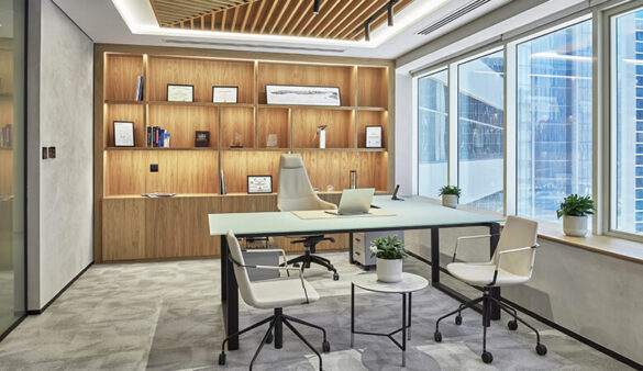
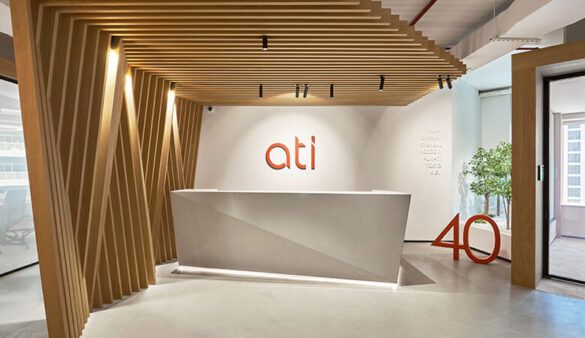
ATI, a multidisciplinary consultancy firm focused on architecture, engineering and interior design, recently moved into its new minimalist head office in the heart of Downtown Dubai, which the firm designed itself.
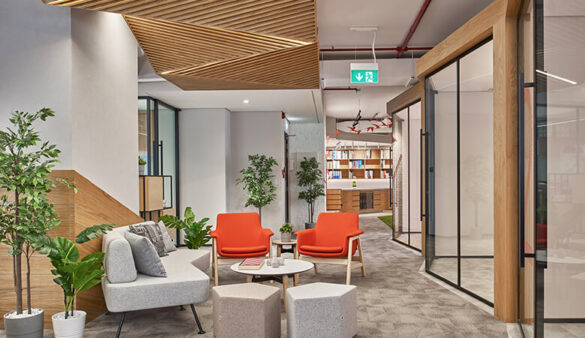
Known for designing spaces that both enrich and support the users’ experience, ATI’s new office perfectly blends biophilic and origami-inspired concepts with the everyday functionality of a busy design studio.
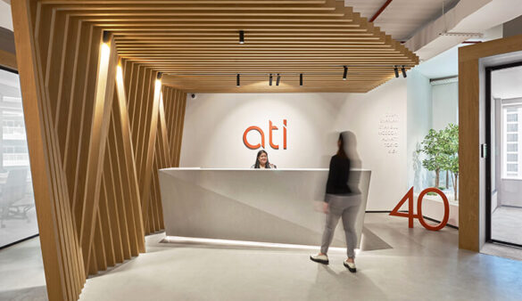
In addition to moving, ATI is also celebrating 40 years in business and more than 700 completed projects worldwide, delivered by its teams in Dubai, Sharjah, Istanbul, Tokyo, Kiev, Almaty and Moscow.
“In celebration of our 40th anniversary, we decided to relocate our architecture and design team to a newer, larger space that better reflects our history, as well as our new brand vision, approach to design and creative work we do,” says Altug Ajun, executive director at ATI. “I’m so grateful that we had this opportunity to rethink our own workspace that now truly represents who we are, allowing us to both concentrate to collaborate together as a team.”
Spanning 500m2, ATI’s design team was tasked to create a new home base that would feel both millennial-friendly, catering to its younger staff members, and timeless, celebrating its rich history.
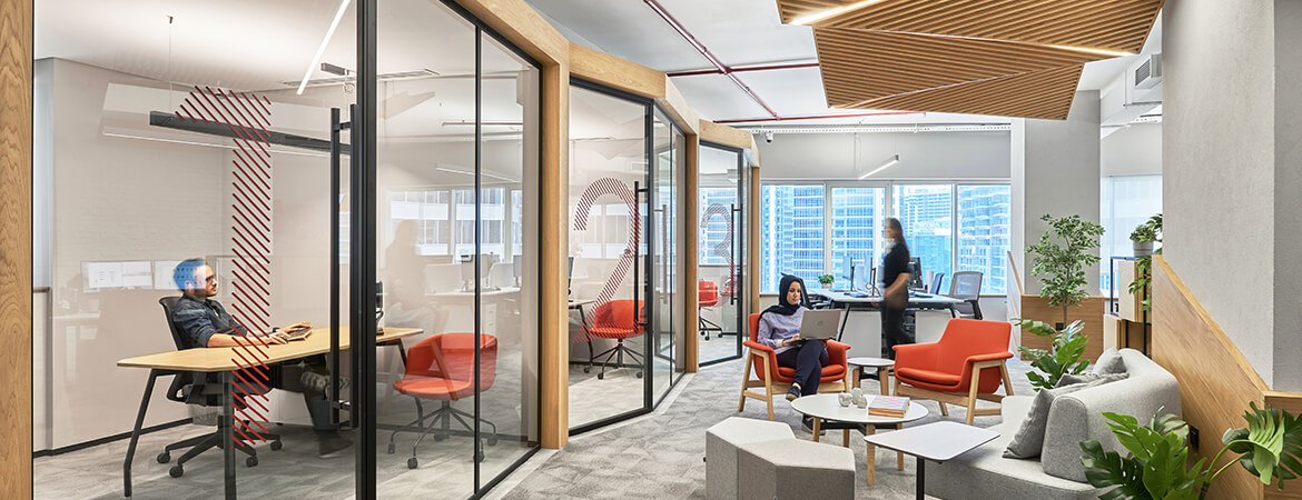
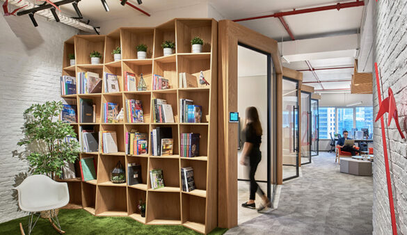
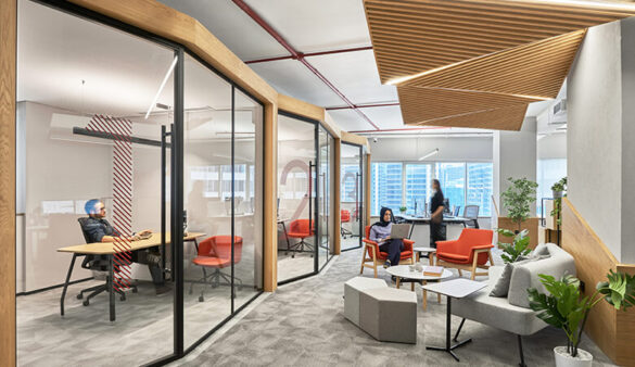
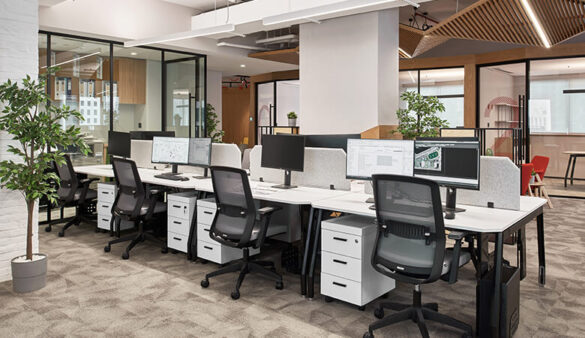
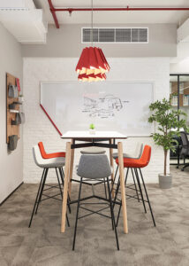
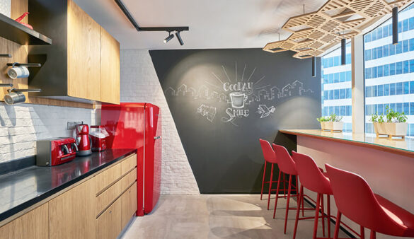
Divided into three zones – public, semi-public and private – the office includes permanent and flexible workplaces, creative zones and relaxation spaces. The design team created several distinct areas within an open-plan layout to allow uninterrupted interaction, communication and free movement between the staff.
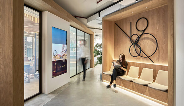
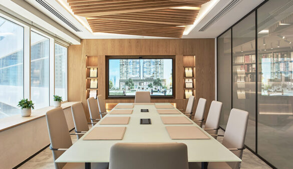
The use of natural light throughout the space has been thoughtfully considered, alongside the adoption of natural and sustainable materials. From the recycled wood flooring to the extensive use of biophilic design concepts, a calm, peaceful vibe has been achieved for deep concentration and research. While the space keeps consistent with a raw, earthy palette, it also delves into the theory of colour psychology with subtle accents of red blended to reflect ATI’s brand identity.
“Geometric shapes and diagonal cuts were applied to align with our new brand identity,” comments Dilara Ajun, ATI’s creative director. “The use of origami and paper inspired the overall concept, so often used and symbolised with the practice. The red colour can be quite aggressive, so we only used accents of red to complement the overall colour palette.”
Private pods have been used throughout to suggest small buildings, a design feature that pays homage to the nature of the practice. These workstations can also be adjusted to the employees’ needs, creating a collaborative atmosphere to connect, brainstorm and exchange ideas. ATI’s design team made sure that its staff, who are sometimes working long hours, stay comfortable when sitting by utilising ergonomic chairs.
When it comes to lighting, luminaires have been provided to flood the space with adequate light, illuminate specific design features, and create an inviting and productive environment. Acoustic flooring and panelling have also been implemented to improve the soundscape, reduce noise pollution and facilitate communication between employees.
ATI’s new head office celebrates the firm’s hard work and dedication over the last four decades as well as its creative vision for the future.

