by Ebraheem Al Samadi, Founder and CEO of Forever Rose
Various cultures talk about the link between the design of a space and its effect on the observer. In recent years, the prominence of this link has come to the forefront due to the heightened study of psychology and its varied implication in design. Perception of design is very subjective, however, certain aspects have universal meanings and associations utilised by designers to evoke feelings of warmth, joy, comfort, etc. It might seem formulaic, but the reality is that individual creativity comes into play when using these various elements with each other to create a holistic design.

The openness of the space is something that we, as observers, notice first when entering a hotel or restaurant. How well are the tables and utilities spaced out? Are the tables too close to each other, does the space seem small in relation to the number of people in it. The list goes on. It is natural to come to the conclusion that openness of a space is directly affected by the physical dimensions. This is far from the truth. Open space planning is all about including the right lighting, indulging in minimal aesthetics and ensuring that a clear design thought flows through the space.
White can open up the space and accentuate its elegance when used in conjunction with other colours
The lighting of a room is crucial to enhancing the spaciousness, and thereby the mood, of the person who enters it. During the day, nothing can substitute the best source of lighting – the Sun. Tall French doors and floor to ceiling windows can help in bringing the much required source of Vitamin D. In short, adding more windows helps sunlight sweep, boosting one’s happiness, increasing feelings of warmth or decreasing anxiety. The interiors of Forever Rose Cafe, Boxpark are filled with windows that look out to the bustling city of Dubai and provide a burst of energy as a result of sunlight streaming in.
The lighting of a room is crucial to enhancing the spaciousness
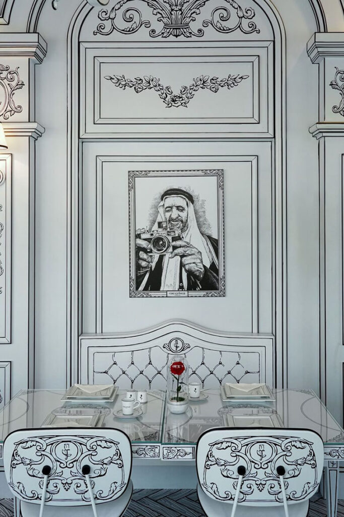
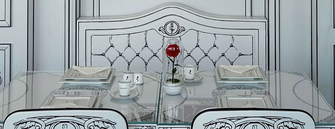
Besides lighting, another important factor that regulates the spaciousness of a room is the colour palette used within its interiors. White colour is famously associated with purity and cleanliness. Too much of the colour, in a mundane layout, can lead to a sense of sterility, as of a medical setting. White can open up the space and accentuate its elegance when used in conjunction with other colours. The 2D illustrations that make up Forever Rose Cafe are a testament to subtle influence and beauty of the colour. Serene white colour is stunningly contrasted with the dominant black colour, adding depth and definition to the overall design. The central design is further accentuated with pops of red in the form of the signature Forever Rose eternal flowers.
The room incorporates certain elements of biophilia with its lush roses, floral design and textures that mimic natural materials. These elements combine with whimsical cartoon characters that are reminiscent of childhood days. The overall result is a space that is in perfect harmony with its unique design aspects, creating an atmosphere of peace, joy and undeniable positivity. A must visit spot for those looking to lift their spirits, on a gloomy day.
